Serious Sans
A legible monospace font for playful professionals. Comic Sans for hackers
This font is a fork of dtinth's Comic Mono, which in turn is a fork of Shannon Miwa's Comic Shanns (version 1)
Example Text
the five boxing wizards jump quickly.
THE FIVE BOXING WIZARDS JUMP QUICKLY!
0123456789.:,;(*!?')
Downloads
TrueType Format
Nerd Font
SeriousSansNerd.otfWhat?
Serious Sans is a legible monospaced font made to resemble the classic Comic Sans font we all know and love. It is designed to be suitable for use in a professional coding environment while retaining the playfulness of the original
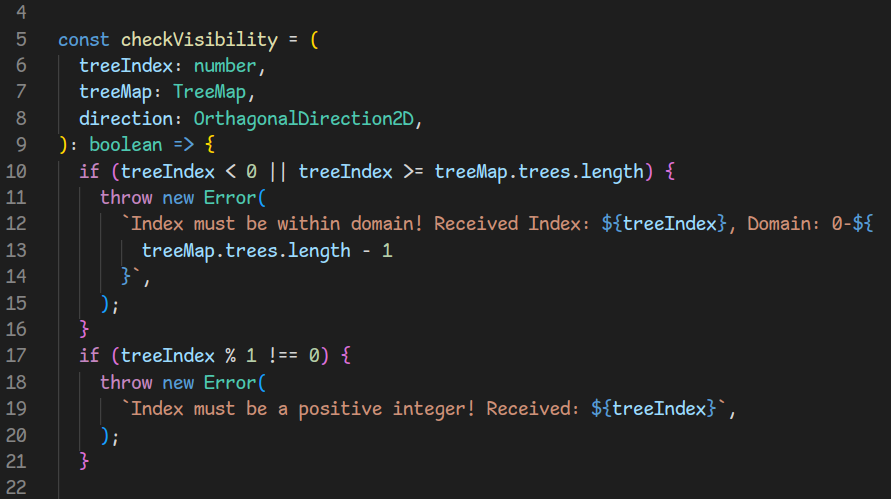
Here's what it looks like viewing one of my Advent Of Code functions in VS Code:

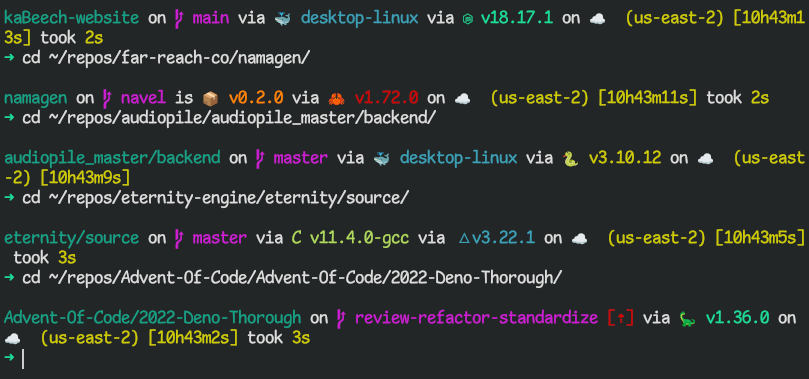
Here it is in the terminal, showing off the fancy Nerd Font symbols:

Why?
To help overcome writer's block, some writers change the font of their word processor to Comic Sans. Perhaps the jaunty style helps put our brains in a playful mood so we can just write without getting hung up in self-criticism
Serious Sans aims to provide that same experience for programmers and their IDE's. As coders, we also enjoy playful styling and tools that help us just get to work. But most of us like to have certain standards that make our work easier. Monospacing and legibility are important factors that facilitate quick scanning of many lines of code
Legibility
Legibility means being able to quickly tell which character is which. In fonts with low legibility, for example, it can be difficult to tell the difference between an upper case 'I' and a numeral '1'
Monospacing
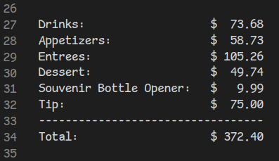
Monospacing means ensuring every character has the same width. This is helpful to quickly line up rows of text. For an example of why this is helpful, consider adding up a fancy dinner bill:

Without a monospaced font, getting all those numbers to line up for easy adding would be a pain!
Origins
I originally changed the font in my IDE to Comic Mono as a joke. I decided to leave it that way for a while for fun, and found that it actually seems to help my mindset while working. I made Serious Sans as my own leetle fork to improve the usability of the font ^_^
Differences from Comic Shanns/Comic Mono:
- • Edits the 'a' to make it look less like an 'o'
- • Remakes the Bold weight style and adds a Light weight style as well
- • Adds Italic styles for each weight style
Update 2023-09
- • Adds Nerd Font patch
Any issues?
If you notice any, please feel free to open an issue!
The Light weight version could use a little refining still (the height and x-height seem to be off for some glyphs). I improved the x-height for the Light Italic style (where it was especially noticable) but I have not yet improved Light Original
There are some horizontal alignment issues with t/T's and f's in the Italic styles
GitHub
Serious Sans is hosted on GitHub!
License
Serious Sans is licensed under the MIT License
Disclaimer
Please note that this font is in no way affiliated with the delightful Serious Sans Pro font. I just like classic PC games ^_^